Logo Legends: Deconstructing the Genius Behind Iconic Designs
Logos. They’re everywhere, whispering sweet (or not-so-sweet) nothings about companies from Silicon Valley giants to the corner burger joint. But what separates the truly legendary logos from the forgettable scribbles? Let’s dissect the DNA of four iconic brands – Apple, Nike, McDonald’s, and Coca-Cola – and uncover the secrets behind their logo success.
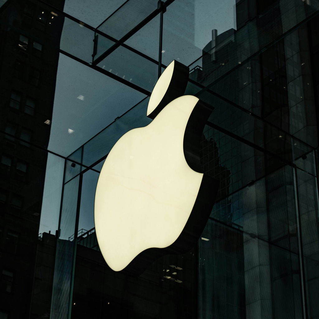
Apple: The Bite-Sized Masterpiece
The minimalist apple, with its single, clean bite, embodies so much about the brand. It’s simple, modern, and instantly recognizable, just like their technology. The bite itself could symbolize knowledge, temptation, or even a playful nod to their innovative spirit. Regardless, it packs a punch in its simplicity, proving that sometimes, less is truly more.
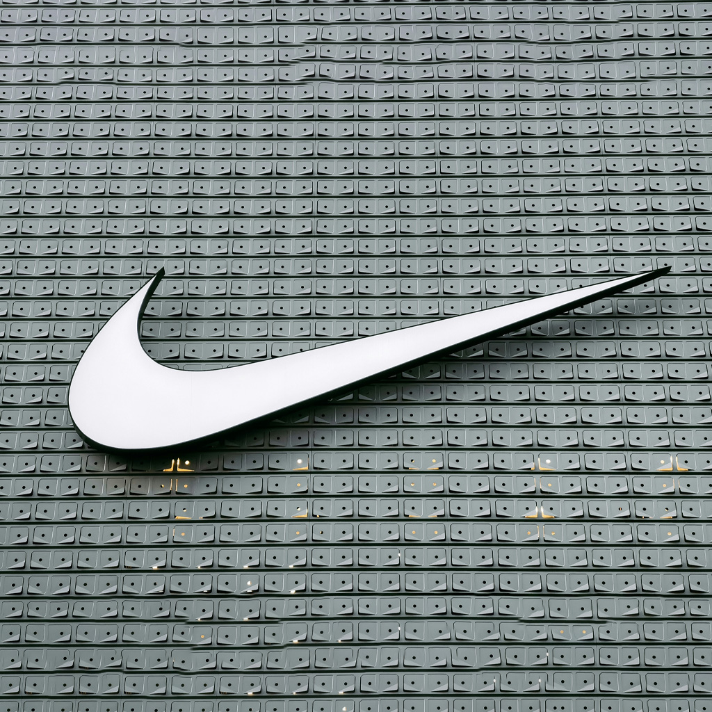
2. Nike: The Swoosh of Victory
The iconic swoosh, inspired by the Greek goddess of victory, Nike, is a symbol of movement, speed, and achievement. It’s dynamic, energetic, and instantly recognizable, perfectly encapsulating the brand’s message of pushing boundaries and achieving athletic excellence. Plus, it’s incredibly versatile, working seamlessly across different colours, backgrounds, and applications. Talk about a design home run!
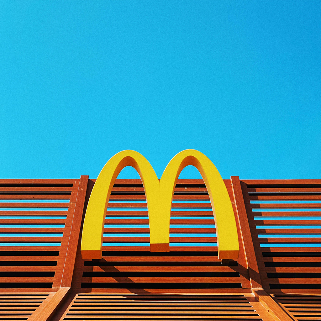
3. McDonald's: The Golden Arches of Familiarity
Those golden arches aren’t just arches; they’re a gateway to childhood memories, happy meals, and the unmistakable scent of french fries. The design is simple, bold, and instantly recognizable, even across geographical and cultural boundaries. It’s also functional, forming an “M” shape that reinforces brand recognition. It might not be the most artistic logo, but its effectiveness is undeniable.
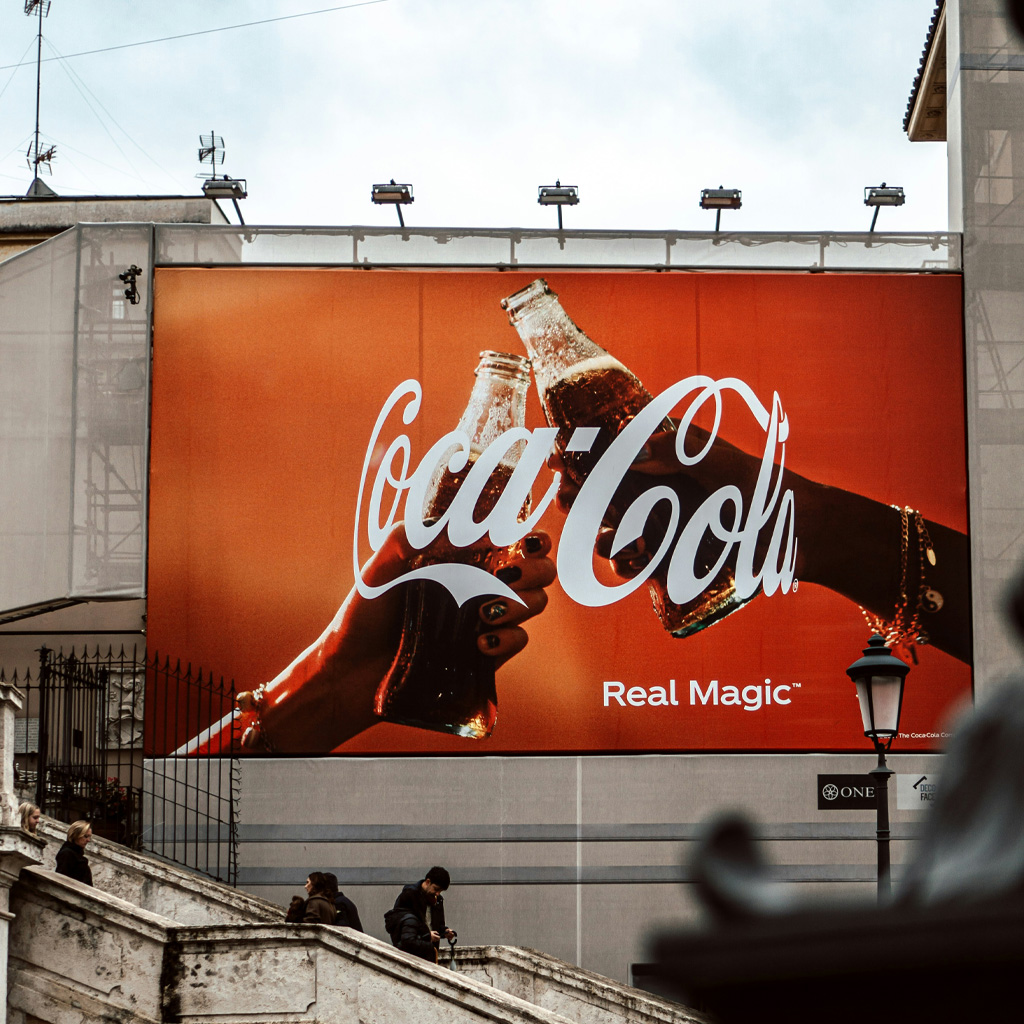
4. Coca-Cola: The Timeless Script of Refreshment
The Coca-Cola logo is a masterclass in classic typography. The flowing script is elegant, memorable, and evokes a sense of nostalgia. It hasn’t changed much since its inception, demonstrating the power of consistency and heritage. The red color adds vibrancy and energy, making it stand out on shelves and billboards. It’s a logo that screams “refreshing tradition” and has become synonymous with the beverage itself.
So, what have we learned from these logo legends?
It’s not just about intricate details or trendy designs. A truly great logo should be:
01.
Simple and memorable
Like the bite out of the apple, it should be instantly recognizable and easy to recall.
02.
Meaningful and symbolic
Each element should connect to the brand's core values and story.
03.
Versatile and adaptable
It should work seamlessly across different platforms and applications.
04.
Timeless and relevant
It shouldn't be a slave to trends but should have staying power.
Remember, your logo is more than just an image; it’s the face of your brand. Invest in a design that tells your story, resonates with your audience, and sets you apart from the competition. By understanding the secret sauce of these legendary logos, you can create your own design masterpiece that stands the test of time.
Feeling Inspired?
Get in touch today, and let’s craft a logo that’ll have your competitors saying: “We wish we thought of that!”