
Few brands are as deeply ingrained in American history and culture as Ford. Founded in 1903 by Henry Ford, the company revolutionized transportation with the Model A, making cars accessible to the masses. But beyond its iconic vehicles, Ford boasts a logo that has undergone a fascinating 120-year evolution, reflecting the company’s growth and adaptation over time.
Unlike the minimalist oval we know today, the original Ford logo unveiled in 1903 boasted a much more ornate design. It featured a striking circular shape adorned with elegant, swirling embellishments inspired by the Art Nouveau movement. This artistic flourish reflected the artistic trends of the time and imbued the logo with a touch of sophistication. The circle housed the company’s full name, “Ford Motor Co. Detroit, Mich.-,” written in a traditional, non-scripted typeface. Interestingly, the blue colour, often associated with Ford today, was absent from this initial design.
This logo, the brainchild of C. Harold Wills, one of Henry Ford’s earliest collaborators, graced the very first Ford car, the Model A, marking the beginning of a legendary brand journey. It stands as a testament to the evolving design tastes of the era and serves as a reminder of the company’s rich history.

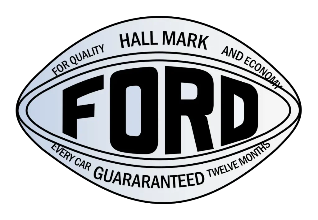
In 1907, a significant chapter unfolded in Ford’s brand story, not on American soil, but across the pond. It was Perry, Thornton, and Schreiber, pioneers who paved the way for the first Ford Motor Company in the UK, who introduced the iconic oval emblem. This innovative design wasn’t just an aesthetic choice; it served as a powerful marketing tool, advertising Ford as the “epitome of reliability and economy.”
This early iteration of the oval emblem, though not the exact design that became synonymous with Ford, holds great historical significance. It marked the beginning of a visual language that would ultimately become a cornerstone of Ford’s global identity. The oval represented not just a brand, but a promise of dependability and affordability, values that resonated with consumers and helped to propel Ford’s rise as a major player in the automotive industry. While the logo has evolved considerably over the years, the legacy of the 1907 oval emblem serves as a reminder of the company’s commitment to providing reliable and accessible transportation, a mission that continues to shape its brand identity today.
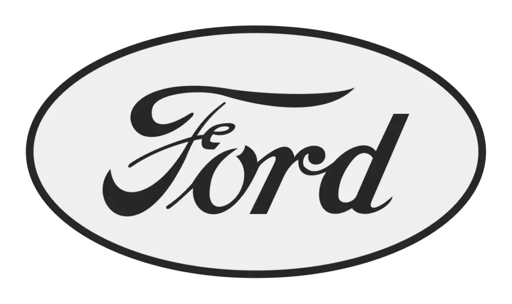
In 1909, the Ford Motor Company embraced a shift in its visual identity. This scripted design featured distinctive characteristics, including elongated tails on both the “F” and “D” letters, adding a personal touch and a sense of momentum to the logo. This design was referenced as the “script with wings.” While the elongated tail on the “F” would remain a defining feature, the tail on the “D” was later removed, streamlining the design and paving the way for the recognizable script we see today.
This adoption of the signature typeface marked a significant step in the company’s branding journey, as it injected a human element and a sense of authenticity into their visual identity.

In 1911, the Ford logo underwent a significant transformation, marking a step towards the iconic image we know today. This iteration featured the word “Ford” in bold, slightly altered script lettering compared to its predecessors. This change aimed to increase legibility and enhance visual impact.
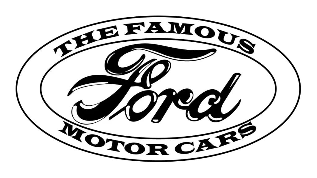
Unlike previous iterations, this oval housed the words “The Famous Motor Cars” in block letters, further emphasizing Ford’s growing reputation for quality and innovation. Additionally, the logo incorporated a design element that resembled a coat of arms, adding a touch of refinement and heritage to the overall visual identity.
This 1911 logo showcased a clear evolution in Ford’s branding strategy. The bolder script, the descriptive phrase within the oval, and the coat of arms-inspired element all contributed to a more confident and authoritative visual language, reflecting the company’s growing stature in the automotive industry.
In 1912, Ford embraced a minimalist approach to its logo, opting to streamline the design of 1911. The “Ford” name, rendered in a stylized version of the signature, became the centerpiece. It was placed inside a clean white oval framed by simple black lines. The tagline “The Famous Motor Cars” was removed, resulting in a logo that exuded timeless elegance lasting for a full decade.
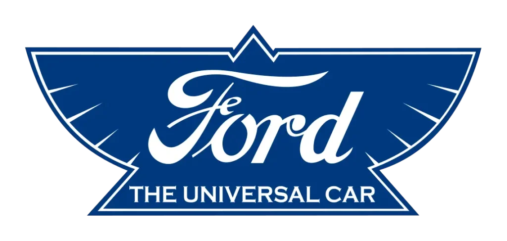
1912 saw a brief experiment with a visually different design. This iteration, known as the “Universal Car” logo, aimed to convey a sense of dynamism and movement through a distinctive element: a bird or wing design. This imagery, rendered in blue and white, symbolized speed and freedom.
However, this logo also incorporated a significant change – the words “The Universal Car” replaced the previous inscription. This new tagline reflected Ford’s vision of making automobiles accessible to a wider audience.
Despite its novel approach, the “Universal Car” logo proved short-lived. History tells us that Henry Ford personally disliked the design, leading to its swift discontinuation. While this experiment may have been brief, it serves as a reminder of Ford’s willingness to explore different visual identities while highlighting the individual preferences and influence of its founder.
The year 1927 marked a turning point in Ford’s visual identity with the introduction of the now-iconic Blue Oval. This design represented a significant departure from the primarily monochromatic logos of the past. It ushered in a new era with a bold and vibrant colour palette of deep blue and crisp white.
The oval itself underwent a subtle yet impactful modification. A double line was introduced, featuring a thick white outline encasing a thinner blue line. This seemingly minor change added depth and dimension to the logo, making it visually distinct and memorable.
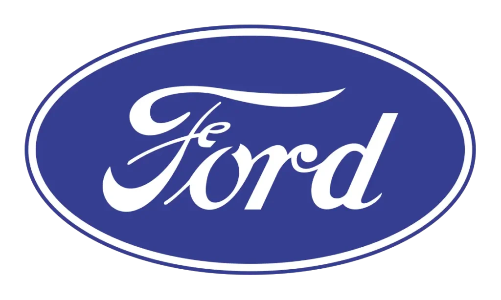
Between 1957 and 1976, Ford Motor Company actively explored various design elements for its iconic emblem. While the typography remained largely consistent, the focus was on refining the logo’s border to enhance its visual appeal and memorability, showcasing the company’s commitment to continuous brand evolution.
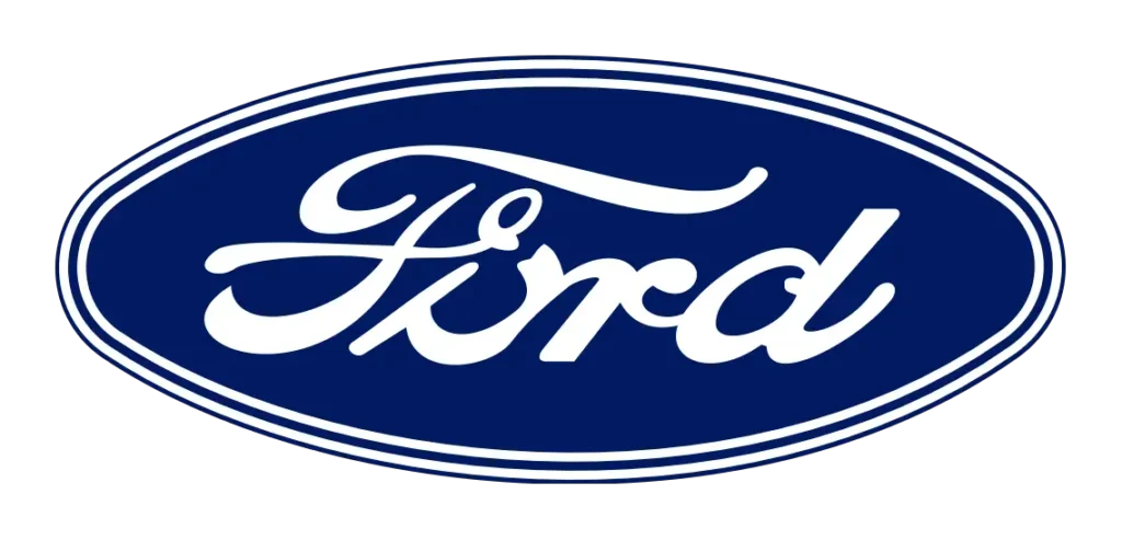
The 1976 Ford logo update ushered in a bold, modernized aesthetic that remains instantly recognizable today. This redesign emphasized a three-dimensional look, enhancing visual impact and ensuring the logo stood out from its predecessors.
Additionally, Ford switched the white typography and border to a sleek silver, further amplifying the logo’s modern and eye-catching appeal.
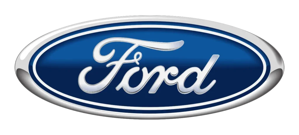
The year 2003 marked a significant milestone for Ford Motor Company: its 100th anniversary. To commemorate this occasion, the company introduced the “Centennial Blue Oval.” This logo, a simplified version of its predecessor, aimed to streamline the design by removing the 3D gradients and shading that were previously present. This created a cleaner, more modern look while retaining the essence of the iconic Blue Oval.
This logo design can still be found on the interior of some models today, highlighting the rich history and continual development of the Ford logo.
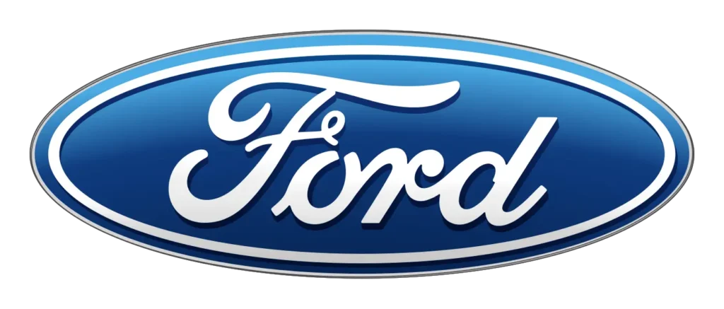
In 2017, Ford introduced a modern interpretation of their iconic Blue Oval, the logo synonymous with the company since the late 1920s. This iteration embraced a minimalist aesthetic, featuring a bold blue oval without unnecessary embellishments. It retained the signature script, ensuring a connection to the brand’s heritage.
Ford’s rationale behind the redesign was clear: to reflect their commitment to innovation, technology, and sustainability. The simplified and streamlined design aimed to convey a sense of modernity and efficiency, while still embodying the core identity of the classic Ford logo.
Several factors contributed to the changes:
The logo's evolution reflects the changing design aesthetics of different eras.
Moving to the Blue Oval as the primary symbol enhanced brand recognition and memorability.
The simpler design transcended language barriers and resonated with international audiences.
The evolution of the Ford logo highlights a crucial debate in the world of branding: whether and when to redesign a logo. While a well-designed logo can be a powerful asset, the decision to revamp it is not without its complexities. Let’s delve into the pros and cons of logo rebranding, exploring the potential benefits and drawbacks.

The only real mistake is the one from which we learn nothing.
Henry Ford

Today, the Blue Oval stands as a testament to Ford’s rich history and enduring legacy. It’s a symbol of innovation, reliability, and the American spirit. As designers at Midnight Media, we understand the power of a well-designed and carefully considered logo. The story of Ford’s evolving logo serves as a powerful reminder that a logo can be more than just an image; it can be a brand’s visual narrative, evolving alongside its journey.
Ready to give your logo a refresh? Contact Midnight Media today to learn more about our expert logo design services.